AAI Design Guidelines
Purpose
The goals of these guidelines are:
- A better-looking user interface for the AAI-users
- A familiar look and feel for immediate recognition of an AAI-protected resource
- Avoiding multiple concepts of user interfaces
- A more consistent and easier login process for the users
- Reducing the workload for the web page authors when designing a login interface - templates are provided
- A better support concept that guides users to the right helpdesk
Switch edu-ID Design Guidelines
For Switch edu-ID enabled services refer to the Switch edu-ID Design Guidelines
Recommendations for Identity Provider login and error pages
Login page
- The login page should contain helpdesk information for users that forgot their password.
- It is recommended to use the shadowed design elements of this page for a familiar look.
- Elements where user input is required should use the gray boxes with light-gray background color.
- It is recommended to place the organization logo somewhere on the login page. This helps users to get used to the login page.
- There should be a SWITCHaai logo somewhere on the login page in order to familiarize users with this logo.
Example:
Recommendations for Service Providers
Example:
The AAI login area may be any size appropriate in the context of the page, provided the logos are not resized.
It's up to the web page author to include other information as deemed appropriate into the AAI login area. Switch provides and maintains a number of multilingual links leading to information pages that may be re-used:
http://www.switch.ch/aai/about/ | About AAI |
http://www.switch.ch/aai/faq/ | FAQ |
http://www.switch.ch/aai/help/ | Help |
http://www.switch.ch/aai/participants/ | Participating Organizations |
http://www.switch.ch/aai/privacy/ | Privacy Policy |
Dual Login Fields for Resources
A dual login is required if a resource should be accessed by AAI users as well as non-AAI users (e.g. users from foreign universities or private companies). Accounts of non-AAI users have to be managed by the resource itself.
Example 1a, Dual Login, horizontal alignment with two boxes of the same height:
Example 1b, Dual Login field vertical alignment with two boxes of the same width:
It's composed of:
- A standard login field for AAI users
- A login field for non-AAI users, equal in height on the right hand side of the AAI Login field (example 1a) or equal in width below the AAI Login field (example 1b)
The login field for non-AAI users typically contains form fields for username and password (see example 1a), or alternatively just the login button leading to another page or another server.
Again, it's up to the web page author to include other information as deemed appropriate into this field.
Login Button for Resources
This button can be used instead of an AAI Login field when room is scarce. It may also be appropriate when one can assume the user to be familiar with AAI.
Login Small Button for Resources
This button can be used instead of an AAI Login field when room is even more scarce. It may also be appropriate when one can assume the user to be familiar with AAI.
Login Icon for Resources
If a page contains links to non-AAI resources as well as AAI resources, an AAI Login icon may be placed on the right hand side of a link. This clearly indicates which resources are AAI-protected.
Example:
Journal of Science and Fiction, Vol 324
Organization of Public Knowledge
Professor Genius' Homepage
IoE Research Database
Institute of Example
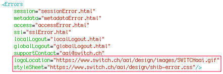
CSS and Logo URLs for Shibboleth Configuration
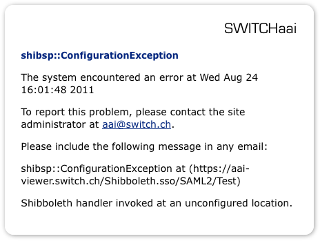
This should then look like this:
And the resulting messages generated by the Service Provider look like shown in this example:
AAI Logos
Although there is no official AAI product logo anymore, it is recommended to use the following image to refer to AAI:
This is the general-purpose AAI logo to be used for presentations or on SWITCHaai related websites. The logo should be an active link to http://www.switch.ch/aai/ on any pages used for information about AAI.
Alternatively, there is a smaller and coloured version of it available:
Compatibility
The html and CSS code is valid HTML 4.01 Transitional code and was also tested using the following web browsers:
- Safari 5 and newer
- OmniWeb 5 and newer
- Firefox 3.6 and newer
- Internet Explorer 8 and newer